This is another one of the fun projects that I did while back for the Silk Road Spice Merchant and just never got around to posting.
They wanted a custom label inspired by old fruit labels, apothecary labels, and shipping labels. They liked the idea of something that looked old and maybe felt like what their logo might have looked like if they'd been in business over a hundred years ago. The purpose of this project was to create an attractive solution for labeling boxes of overstock, especially when the boxes needed to be kept in the front part of the store where customers could see them. They were previously just writing on the boxes with a sharpie.
I looked at tons of examples of vintage labels. With so much visually exciting reference material and inspiration, there were several directions that I could take the look of the label. The business owners were just as excited by the possibilities as I was and so we decided to make 2 labels: one would be full colour and inspired by vintage fruit crate labels and the other would have a limited palette and be inspired by vintage apothecary labels. Both labels would have decorative boarders, hand lettered text and combine several lettering styles. I was excited and couldn't wait to get going on the project!
Here are some of my early explorations:
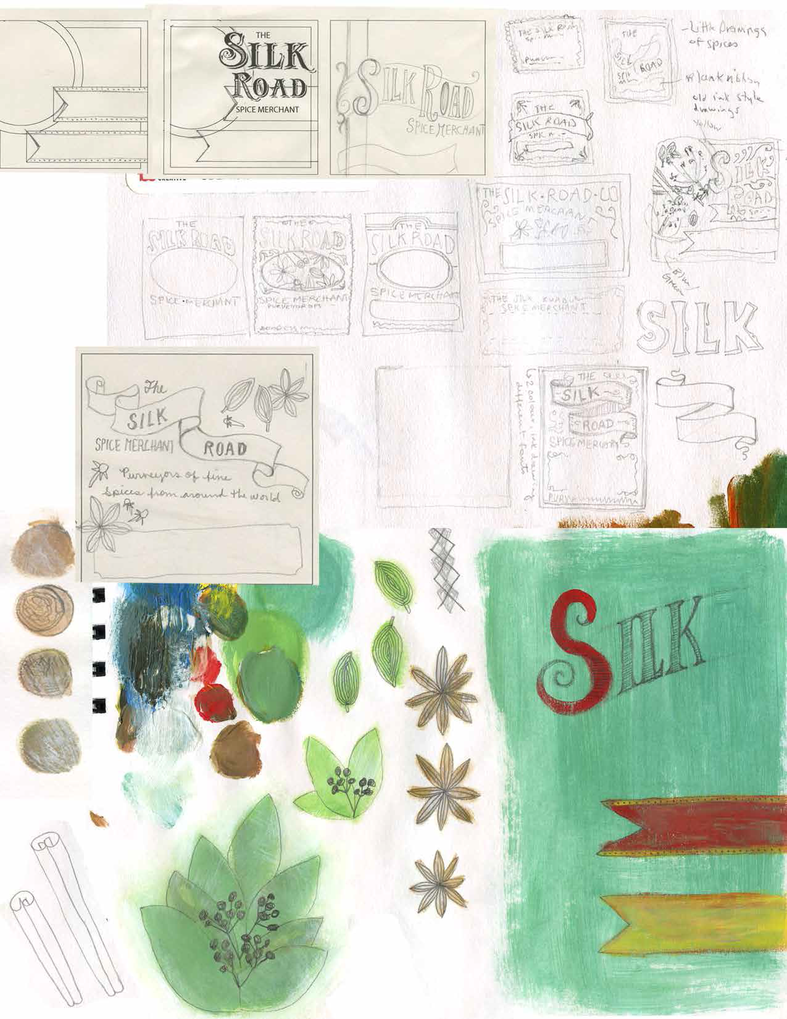
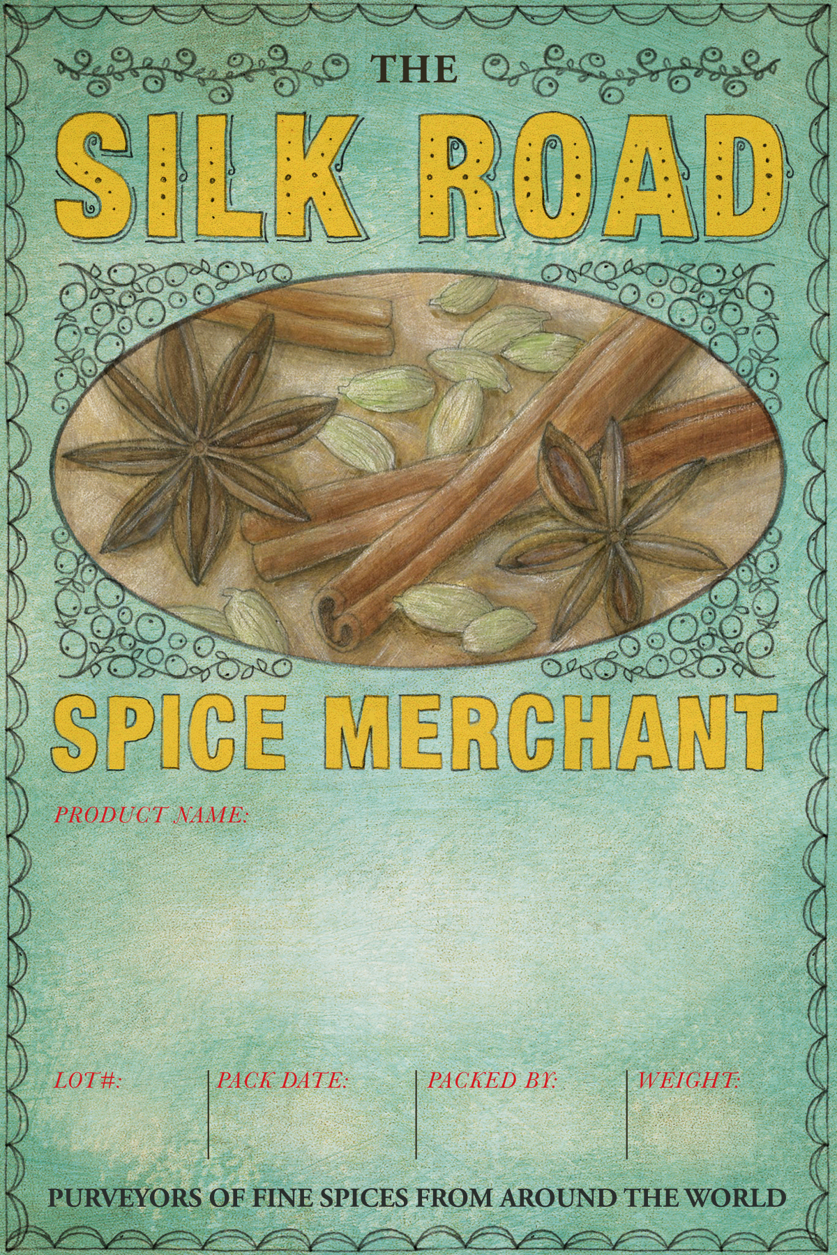
For the full colour label, I wanted to have a somewhat realistic painting of spices, the way that fruit crate labels often have. The colour palette was inspired by a vintage tin that was among the store's decor. I really liked the blue/green background with the red and yellow lettering.
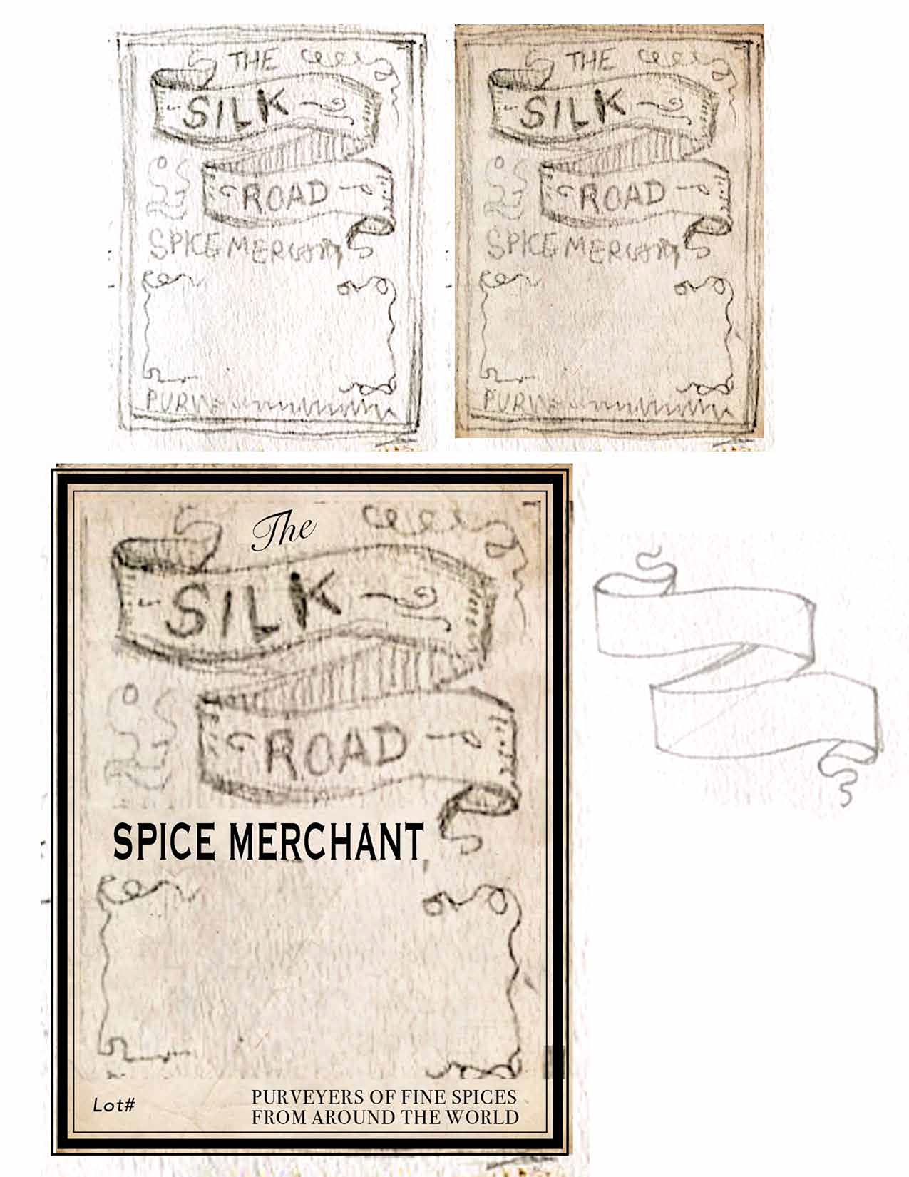
These are the initial sketches for the full colour label:
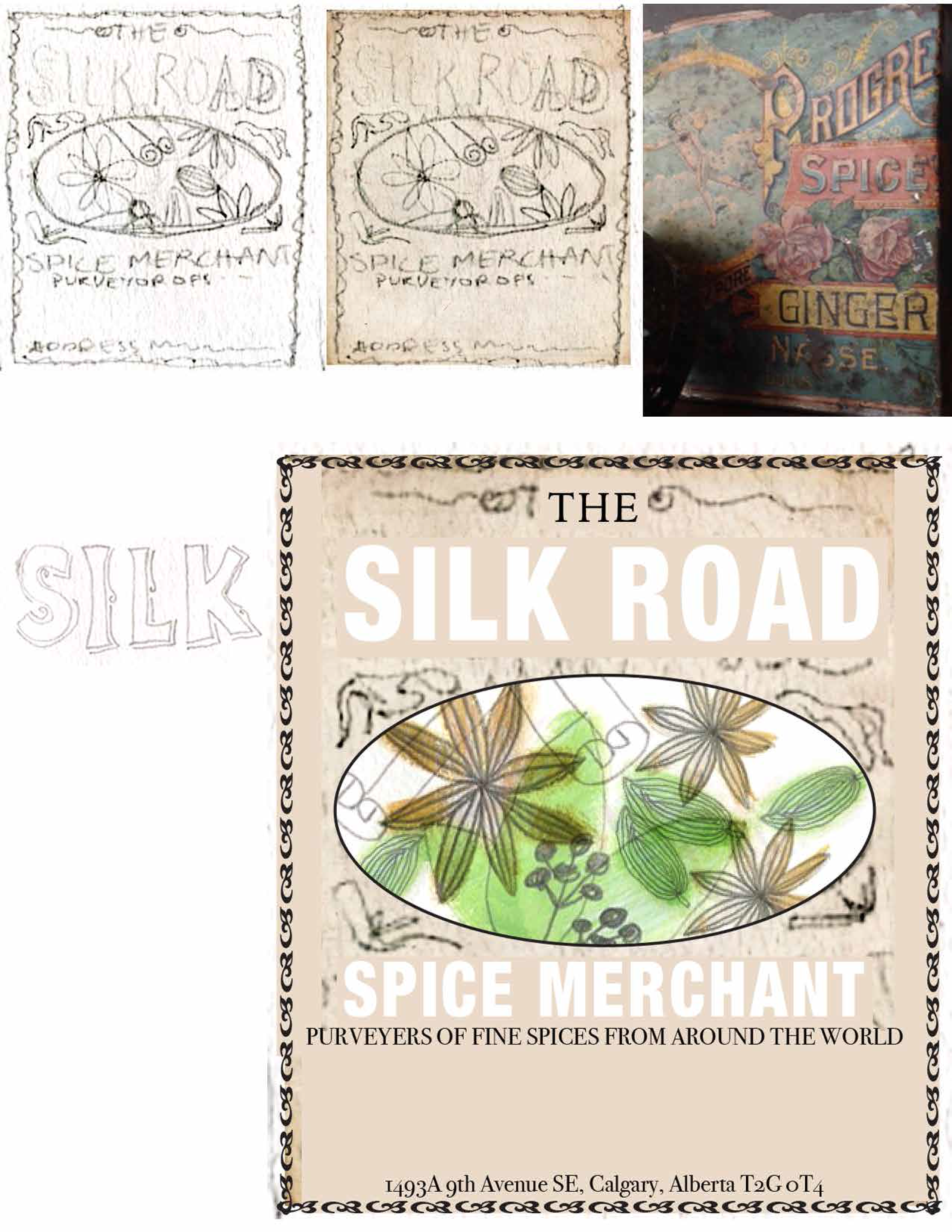
Once I knew what I wanted the label to look like, I started working on the final art. I used star anise, cinnamon and green cardamom pods for the painting since they are, in my opinion, the most visually interesting spices and there was a nice variety of shapes between them. The decorative embellishments are derivative of allspice berries.
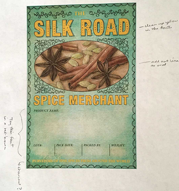
This is the final:
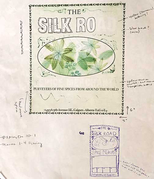
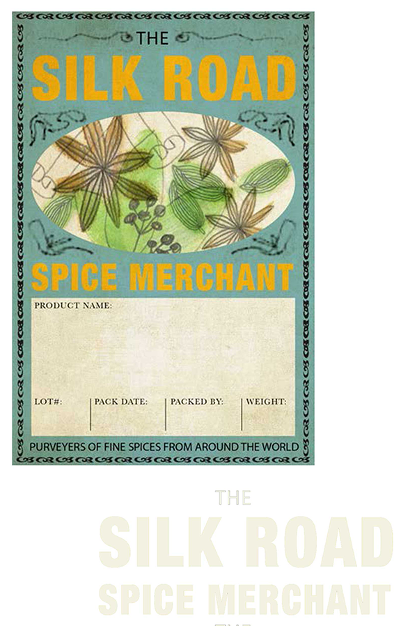
For the limited palette label, I decided that I would use a scroll motif and simplified drawings derivative of fennel seed, thyme, rosemary, star anise and allspice berries. And I would draw the entire thing with a quill pen dipped in black ink.
These are the initial sketches:
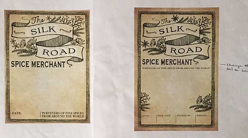
This is the final:
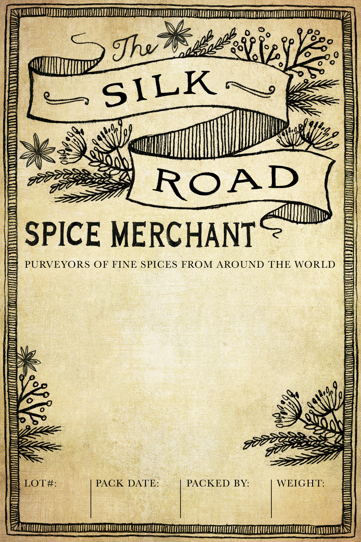
You might recognize the drawing from the chalkboard I also did for The Silk Road. They were so happy with it that we've re-used it on a few projects.
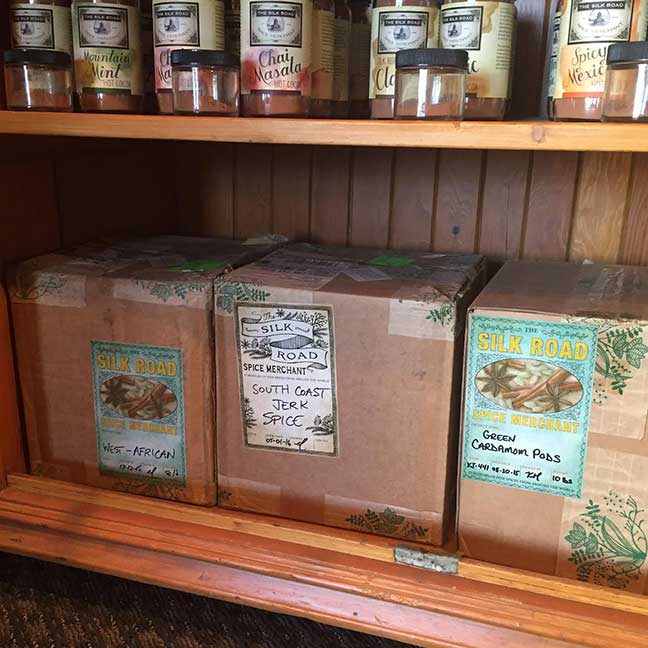
Here's a photo of both labels in context:
Leave a Comment