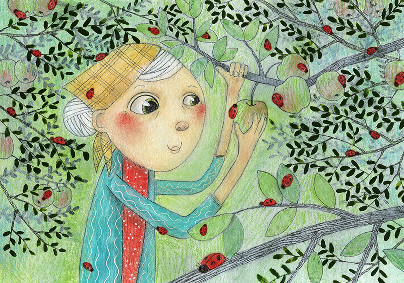
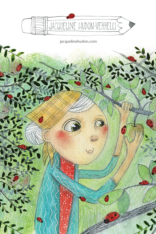
I sent out my most recent promo postcard to editors and art directors in children's publishing this past spring. The image was inspired by a children's book manuscript written by Barb Marshall. Barb runs a great little blog about letter writing and stationary called RiteWhileUCan. I also love following her on twitter for all the quirky content she posts.
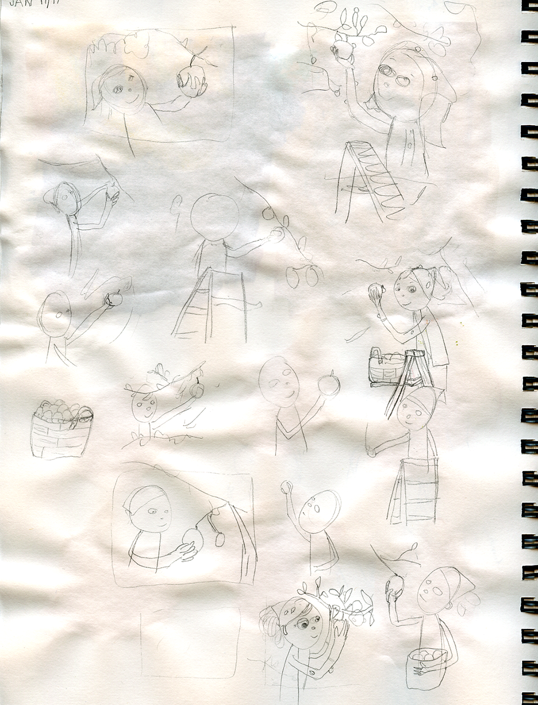
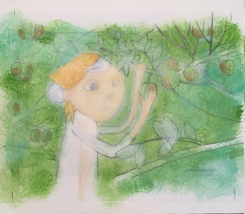
I started by doing lots of loose sketches of people picking apples to figure out how I wanted the composition to work.
Then I figured out what I wanted the apple picker to look like.
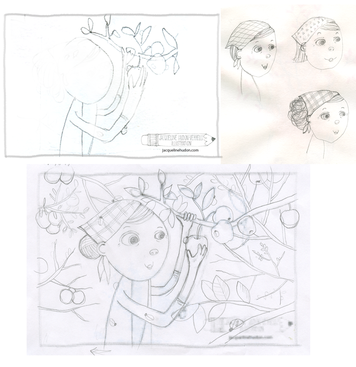
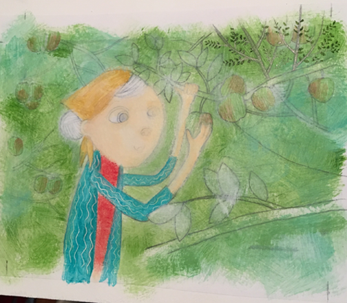
I tweaked her posture a bit and then it was ready to paint.
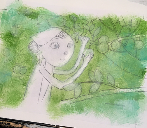
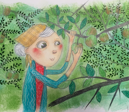
At this point the painting was almost done, and although I was happy with the lady, I wasn't happy with the foliage. I decided the push it back by applying a thin, transparent layer of paint, so I could redraw on top of it.
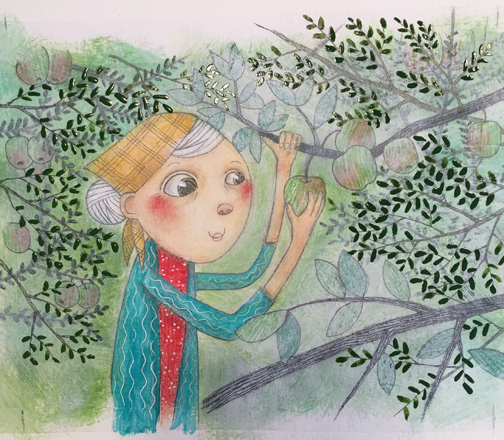
Then I added all the ladybugs and cropped the image to fit my postcard format.
Although I actually designed this image specifically to fit the dimensions of my postcard horizontally, after a bit of experimentation, I decided that I liked a vertical layout better.
This is the finished postcard:
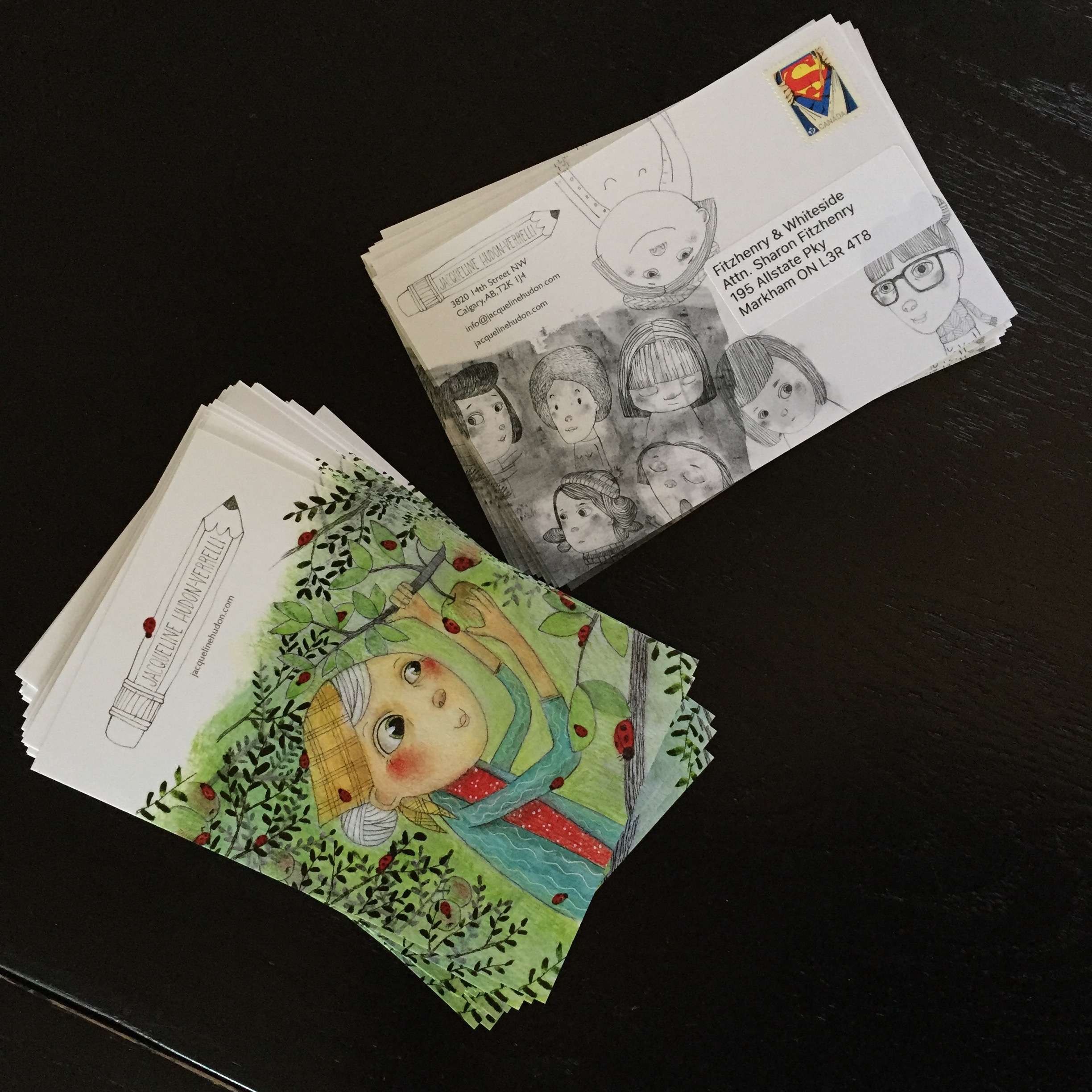
Although I usually like there to be a link between the front and back sides of my postcards, this time I used an assortment of characters from my sketchbook on the back.
Leave a Comment