07
Feb
2007
© 2007
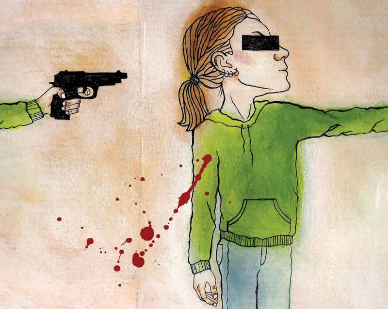
This is my second attempt at this illustration. I used bright orange in the first version I did. The actual painting looked really cool but the scan was awful. I know better than to use that color in something that needs to be scanned and printed, but I loved how it looked in my little color comp so I used it anyway. Bad decision. I had to redo it. Here it is. I'm not sure how I feel about the final. I like the concept, but I'm not sure about this particular execution. I'll probably paint it once more, but not right away. I've been looking at this image for too long.
4 Comments