Last summer I was contacted by the good people at Pajama Press about illustrating a cover for the middle grade novel: Macy MacMillan and the Rainbow Goddess. It's the second book by Shari Green and is written entirely in verse. It already has one honour: it's a Junior Library Guild 2017 Selection, and it hasn't even been released yet. It comes out on May 1st and in anticipation of that, I wanted to write a post about my experience of making the cover for this book.
My art director already had an idea of what she wanted when she first contacted me. My job was basically to come up with an image that included a 12 year old girl, a funky house and a for sale sign. The only description of the girl from the book was that she was deaf and caucasian, and the author pictured her as a brunette, but otherwise it was all up to me. So I went to work sketching houses and girls and other elements for the cover.
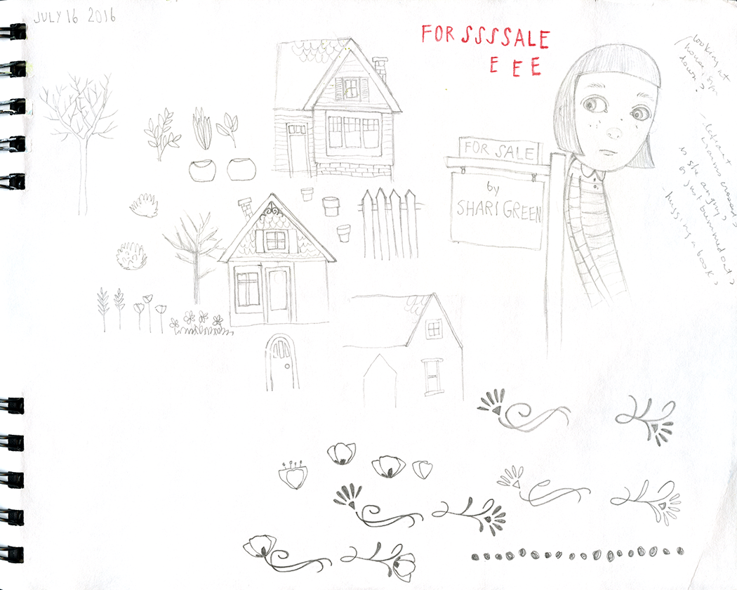
Some of the initial sketches.
Once I had a girl and a house and a sign that I was satisfied with, I played with the composition. I decided to leave a lot of space in the sky above everything for the title and the art director suggested putting the author's name on the for sale sign. I loved that idea.
I wasn't sure at first where Macy should be looking; whether it made more sense for her to be looking down at her feet because she's sad, or towards her house or at the for sale sign... I decided that since she's upset about having to move, I would have her looking in the direction of the sign.
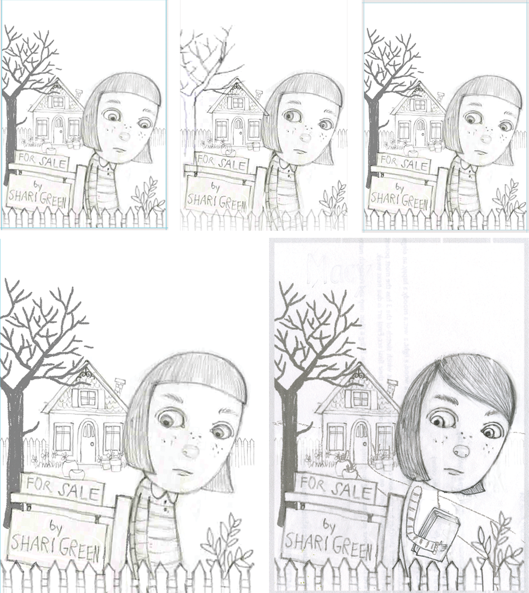
Sketches to determine Macy's expression and where she should be looking.
Bottom right: hairstyle and outfit change.
The art director gave me some great feedback about Macy's appearance, so I changed her hairstyle to make her look a bit older and made her outfit more stylish. I also tried to make her face express more of an attitude so she looked mildly angry.
Once I got approval, I got to work painting the image.
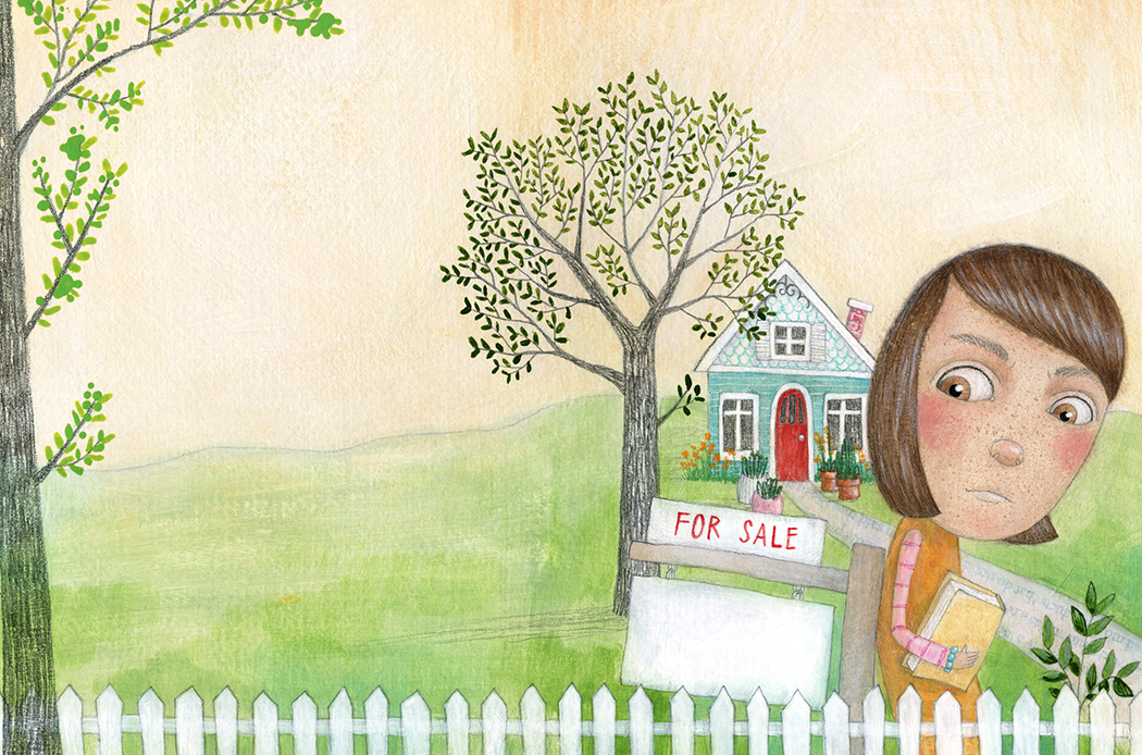
My finished illustration for a wrap-around cover.
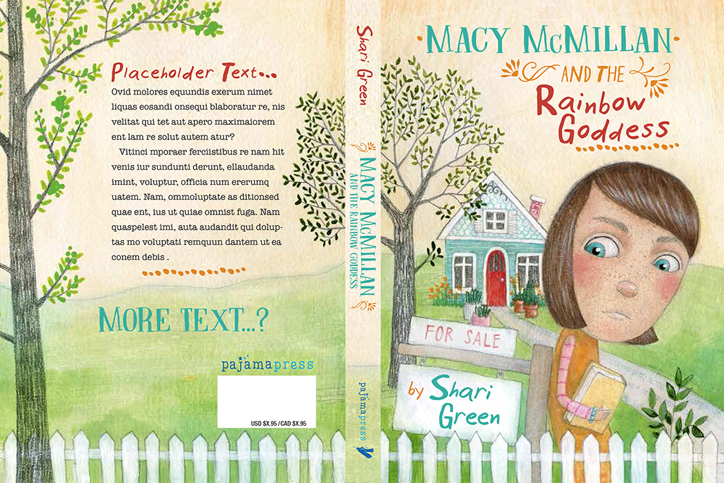
Once I submitted my illustration for the cover, the art director added the text and sent me a mock up. I was so pleased! The design can make or break an illustration and in this case I think the design made my image look its very best. I really feel like the fonts and colours she chose for everything were perfect and brought the whole cover together. She also suggested changing Macy's eye colour, which was a great idea.
Comp with placeholder text.
Unfortunately, a few weeks later I got some disappointing news: the sales reps felt very strongly that the cover should be typographic. As much as I love our initial cover, a book is a collaboration between many people and departments, and in the end, we all want the same thing: for the book to do well.
The art director did a great job of incorporating some of the existing elements from my illustration. I still love our first attempt, but the final cover was a really great solution.
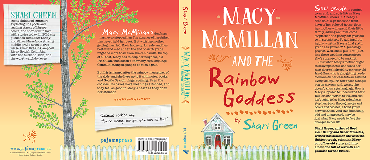
The final book cover.
Leave a Comment